Challenges
Complex data product with limiting UI with poor flow
Each new feature involved adding tables and graphs, additional tabs, or modifying screens
Find a performant and intuitive way to enable drilldown and data exploration
Outcomes
An explorable, extendible and intuitive UX that can be continuously explored
Design for development using Angular Material components
Material design prototype
In developing our web app we shipped more features with fewer issues when making use of Angular Material components. This prototype was designed for development.
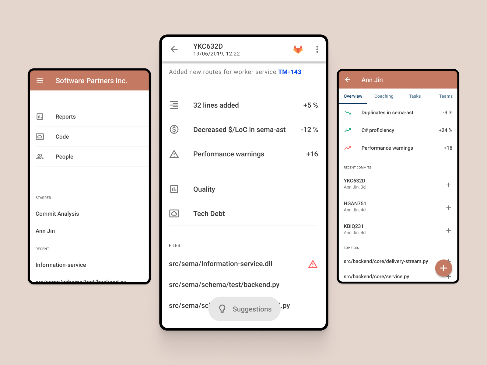
Home screen & sidebar
People commiting code. At a high level, that's what Sema is looking at. It's difficult to seperate them, since when you talk about code, it's a reflection of who wrote it (and who can fix it) and vice versa— people's data is tied to the code they write.
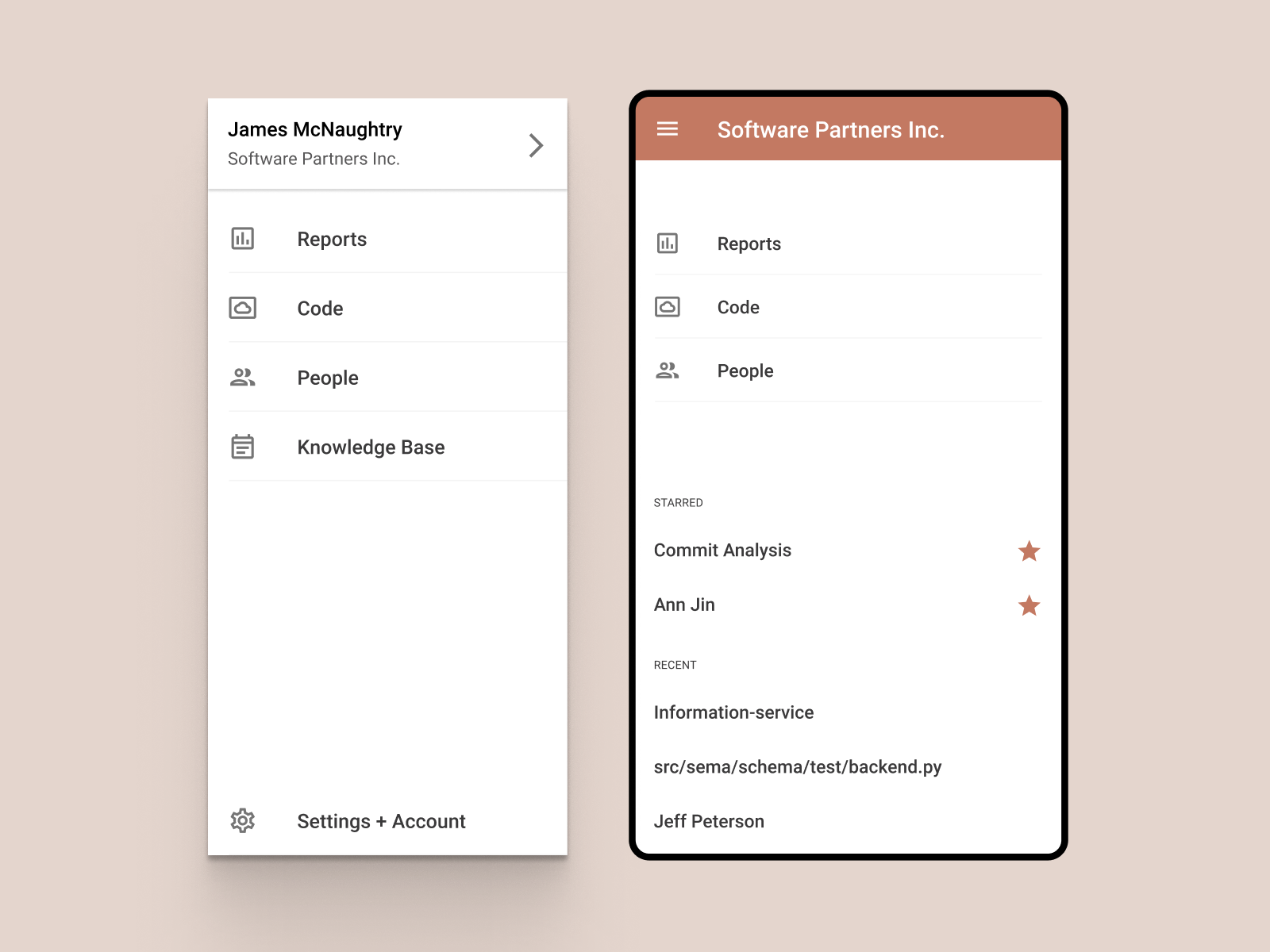
Our navigation reflects how you step into the information;
Reports — this is where you go to see high level graphs and custom reports that have been delivered by the professional services team. The entire current platform would fit into here (see Reports Section)
Code — this is the technical journey for users looking at code quality, architecture, and the work to clean up their code base
People — this is for managers looking at their teams productivity, progress against coaching goals, and work across codebases
The beneath these are two sections for other pages (whether it's a repository or a single line change, an offshore team or an individual)
Starred — where users have starred important items they frequently visit - current initiatives or direct reports
Recent — pages that have been recently visited
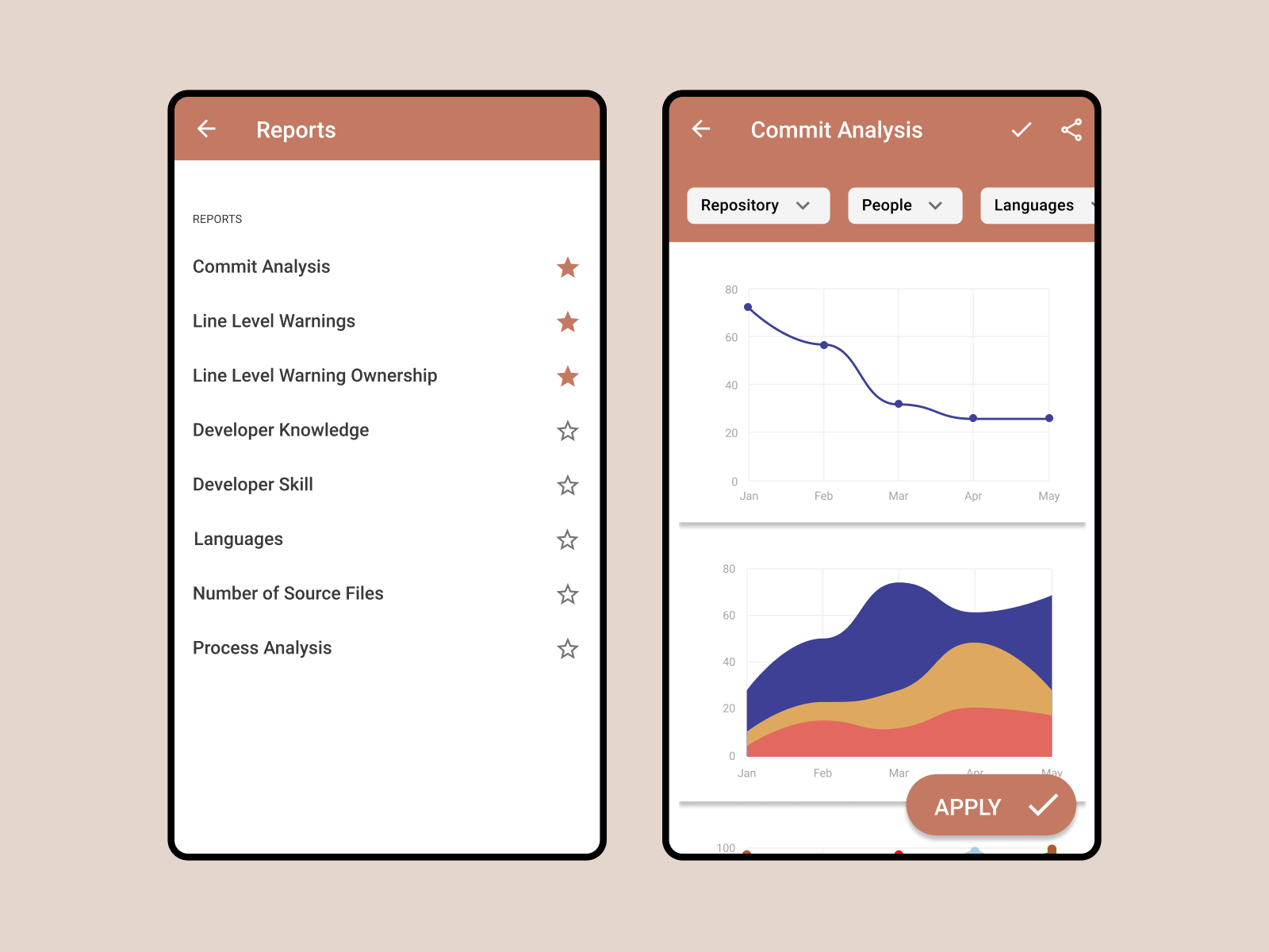
Reports
A list of available reports, with the ability to star favorites or interesting reports. Each report would be rendered either as a white-label embed iframe from our BI tool or one of our home baked interactive visualizations.
Filters would be passed through with a filter panel. This allows white-label filtering and home-baked filtering to function similarly, and gives us a layer to do further grouping on top of the data (ie. grouping people into teams, repositories into projects)
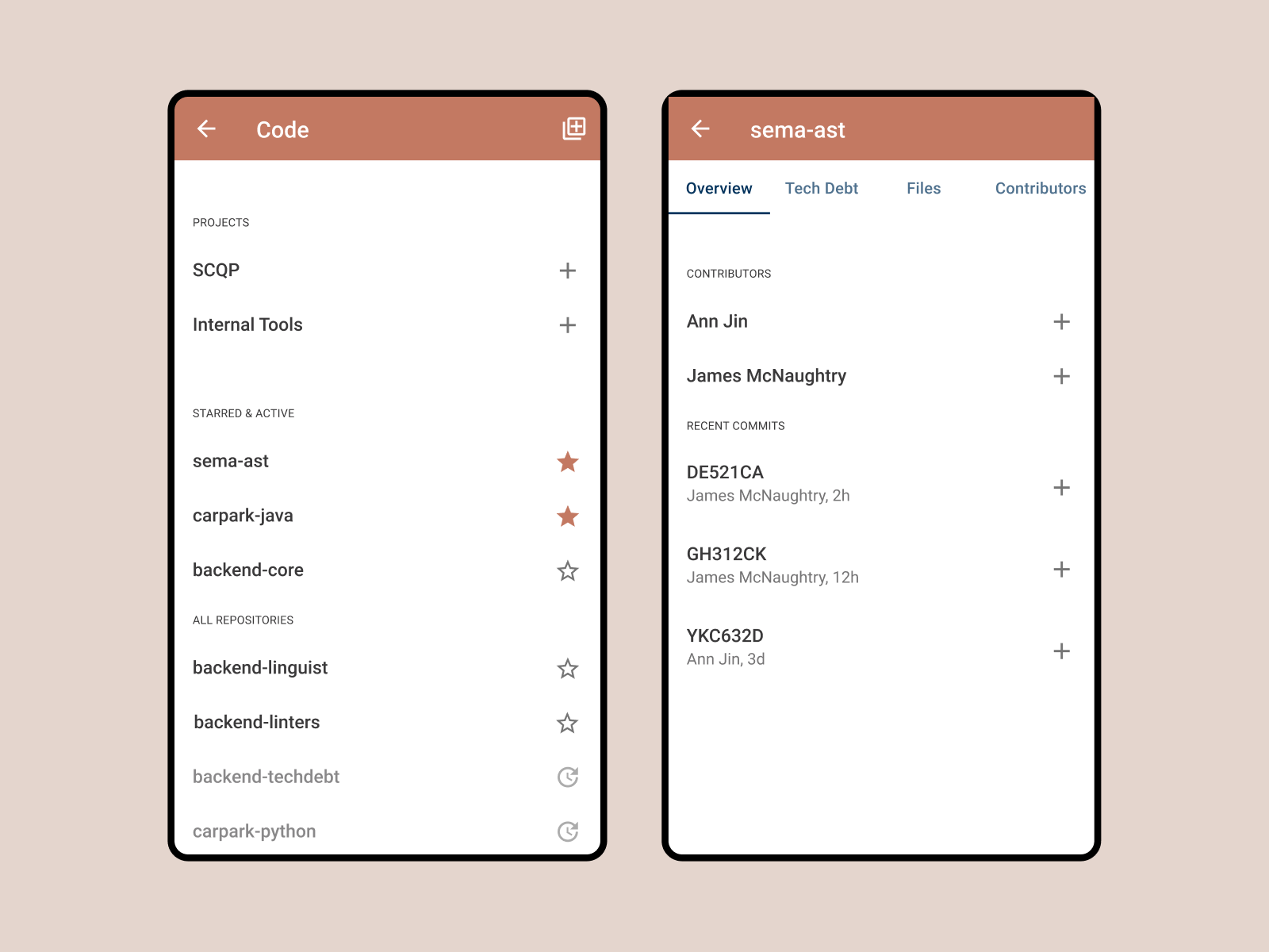
Code
Stepping into the data through the lens of code, users would see a list of active projects and repositories tied to their account. They can quickly land on a homepage for that repo or project, and within that use tab navigation to see a list of contributors, files, or tech debt items.
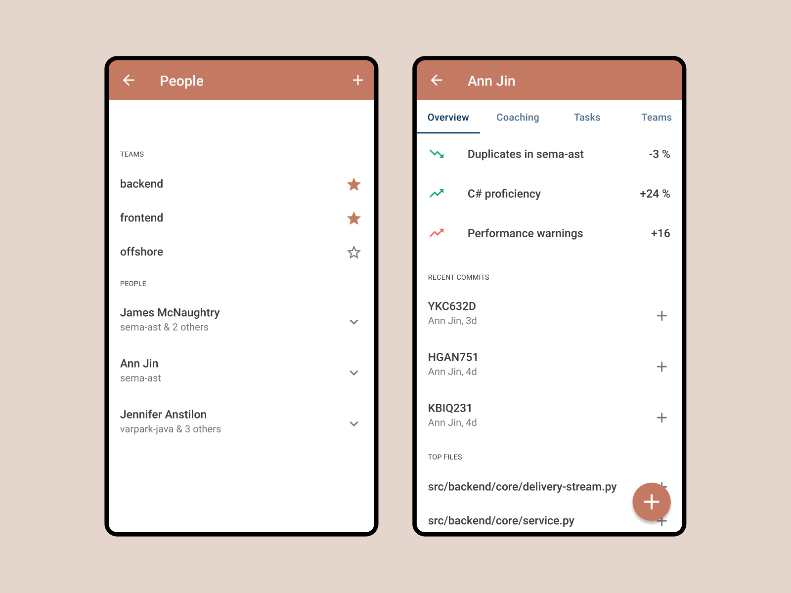
People
From the managers journey, this would often make the most sense. Quick access to a list of contributors in the organization, and the ability to group them into teams.
A team or individual page would surface key information about activity, expertise, and their impact on code. Tabs could have a spot for coaching goals which the system monitors against, or tasks that have been chosen by Sema or the manager to help reach the goals.
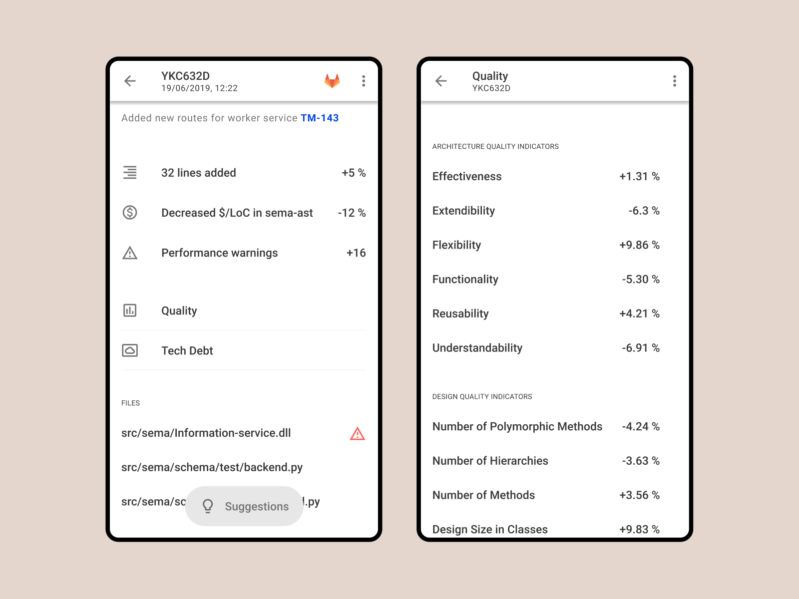
Commit
This granular unit ties together people and code (people commiting code) and is where a user would drill down to figure out what went wrong, or why this code impacted the overall code quality or technical debt to a noticeable extent.