Challenges
Gap between custom reporting and availability in the platform
Professional Services had reached the limitations of their existing tools
New metrics were being introduced as either a new table on existing tabs, or as a new tab with more tables and graphs
Inconsistent dataviz experience between BI reports vs. existing graphs
The Outcome
Integrated a BI tool into the web platform & leveraging the available functionality.
A delivery mechanism for custom and one off reports previously delivered as PDFs
Went from 5+ tabs with no flow to an extensible 2 page template design
More engineering capacity for high value development, less time playing catch-up in the frontend
Background
Sema Software is bringing transparency to software development with new and established metrics for people, process and code. Serving organizations and fortune 500 companies, they offer professional services — individualized reporting, technical due diligence and recommendations catered to the client. The proprietary metrics and data Sema generates is accessed through a web platform.
Phase 1 — Agile MVP
Adding the first report. In order to test the functionality of a BI tool integration we added a single tab called Reports. It housed a white-label embedded of a Mode Analytics report.
All users saw the same report with data specific to their organization. It launched with 2 queries as an MVP and grew to over a dozen queries and graphs, css navigation and tooltips — all with minimal engineering resources.
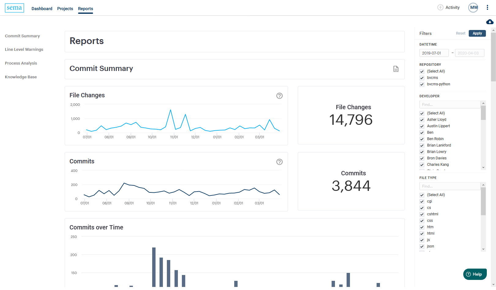
White-label embed reports section using built-in filters, styled with CSS
The page was extended with the support of Professional Services, who began preparing custom reports in the BI tool, and the product & design team (just me). I was able to add queries and graphs, navigation and tooltips, and style the report using the native html/css editor in the BI tool.
The embedded reports and data lake proved a big win as engineering resources were limited. It became the most visited page, had the highest engagement, and user feedback was clear — more of this.
The BI tool was a bet that played out nicely. The company had let a lot of staff go and engineering resources were spread very thin. The progress on the reports made in Phase 1 was done with minimal engineering effort and we were able to add new reports even faster than our weekly production release cadence.
The intuitive interface allowed for myself, researchers, and analysts to contribute to the engineering backlog to complete an exceptional body of work allowing analysts to do everything within the BI tool.
Things go well until they don't
Engineering, Product and Professional Services all agreed on the success of this integration, but we began to notice a few issues;
Discrepancies in data caused by one of 2 issues; calculation in SQL didn't match back-end calculations, a delay between the database and data lake.
Poor page performance as more queries were added to a single report
Hard to navigate and CSS navigation workaround made it delicate adding new queries
Native filtering in BI tool was becoming convoluted, and a challenge to maintain interactivity across queries
Inconsistent experience in the reports vs existing functionality
Can't save and share views, or deliver custom reports — functionality users expected.
Phase 2 — a more elegant solution
We could see a never ending game of catch up, adding report metrics to core platform each time a new report or metric was generated. This would create further fragmentation between the platform and the reports.
This is where lightning struck — a chance to clear house, simplifying the product experience, reducing maintenance and maximize value of the integrated BI tool.
I was particularly proud of this solution from both a design and product management effort. A flexible and extensible reports that makes full use of the BI tool and it's white-label embeds, increasing delivery speed and reducing engineering efforts.
We had a chance to replace all the current navigation pages (3 top level, 5 sub-pages + project selector) with 3 functional components;
1. Reports Section - a list of available reports
2. Report Template - a page housing the iFrame embed of the selected report
3. Report filters - using our own filter layer instead of the BI tools built-in filters
2. Report Template - a page housing the iFrame embed of the selected report
3. Report filters - using our own filter layer instead of the BI tools built-in filters
This was an elegant solution providing improved interaction, no lost functionality and a clean slate for broad product updates to follow.
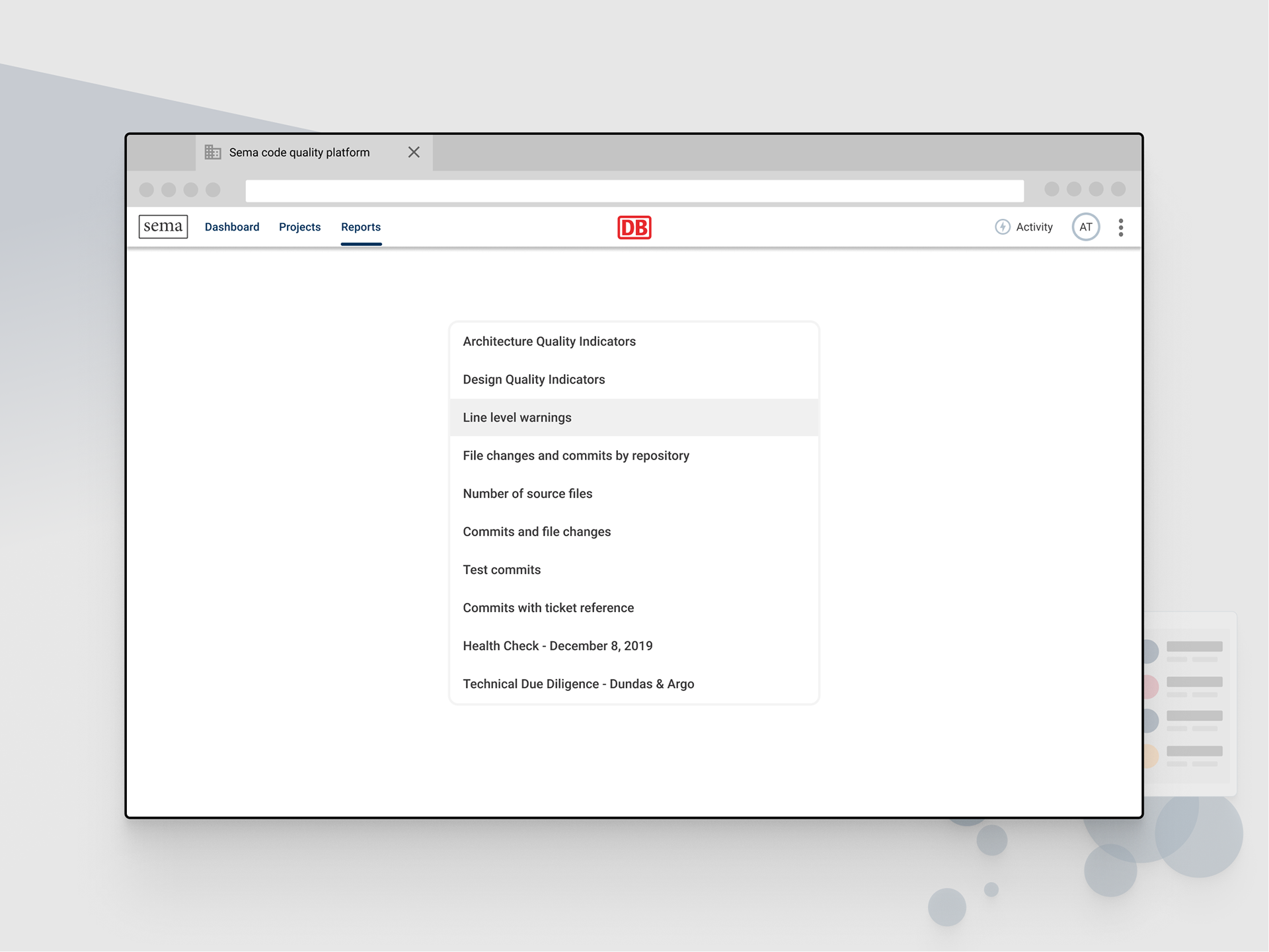
Reports section - a simple list of reports the user is scoped to access
1. Reports Section
Instead of a single page housing one report, we could use the BI tools API to populate a list of available reports which live separately in the BI tool. We could replicate all current product pages into individual reports, work that was already done to support Professional Services.

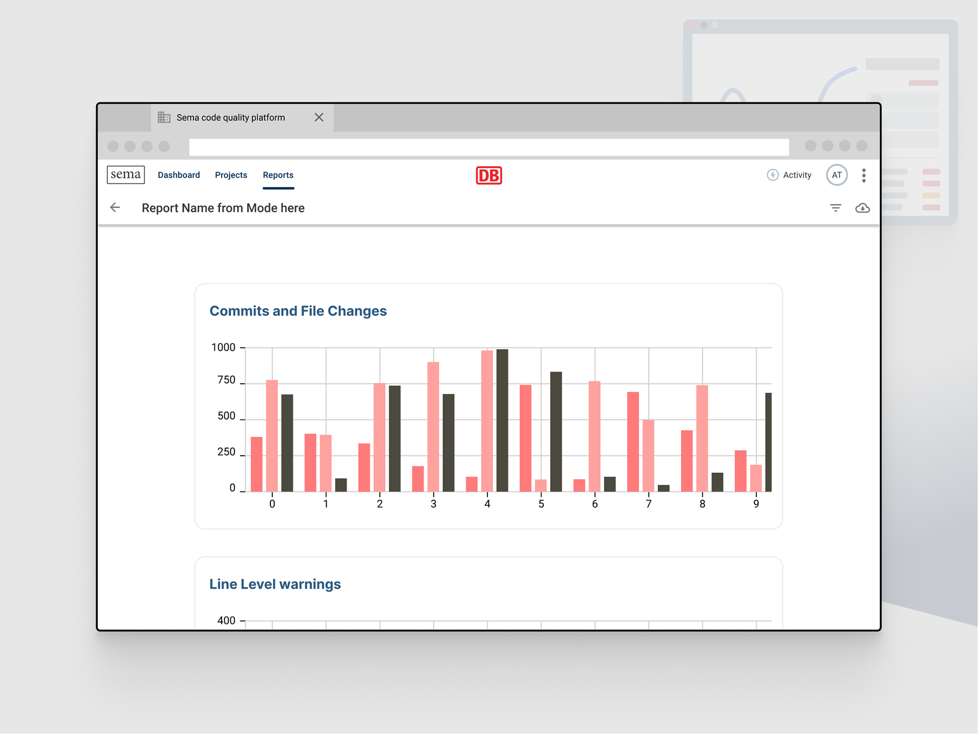
Report template - a white-label embedded iFrame from the BI tool
2. Report Template
This design uses a Material Design top bar with a back button (returns to Reports Section), report title (pulled from the API) and filter and download icons. The content would be a iFrame that loads the report housed in the BI tool.
Aside from the report title and back button, this was already built for the current Reports section.
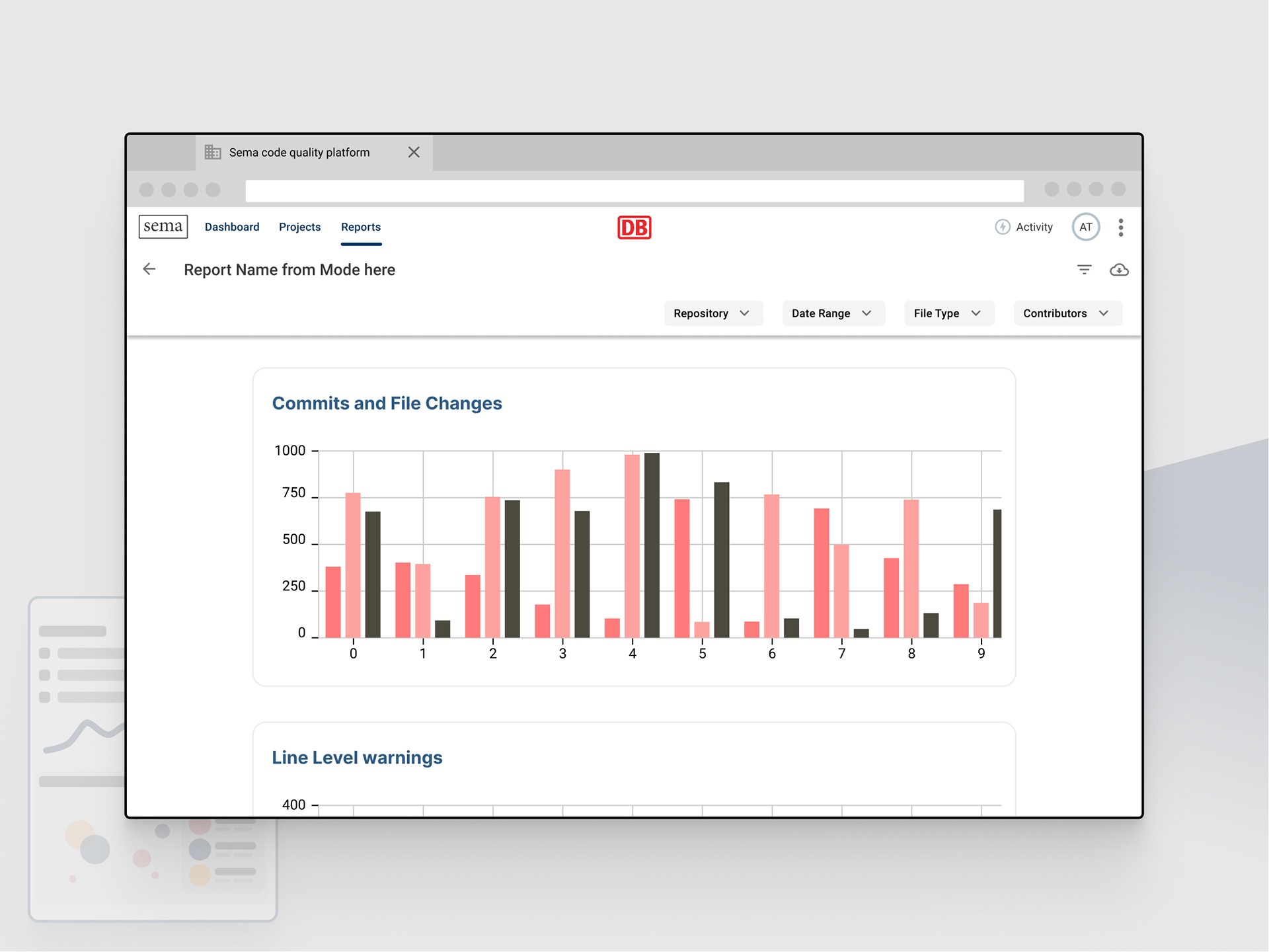
Report filters - users apply filters in our UI which get passed as parameters to the BI tool
3. Filters
The BI tool's built in filters had limitations; there was no visibility into what was being filtered, which meant we couldn't learn from or save filters. The native PDF output in the BI tool didn't include applied filters, so users would download an unfiltered output.
By implementing out own filters we could have full visibility into usage, and create an additional layer outside of the tool to group repositories and teams without modifying existing queries.
Clean slate for the next product phase
After building this design for a new report section, I realized it had the potential to clear out the entire navigation.

The Reports section becomes a freestanding experience, integrating into a redesigned product experience
All secondary navigation links could be broken up and replicated as reports.
A 'Dashboard' report in the BI tool eliminates the need for the Dashboard tab.
Reports are cross-repository, so the Projects tab would be replaced by the dropdown filter
We would benefit from having the the current offering consolidated into a single, extensible Reports section. This change would forgive existing design and tech debt, giving us a clean slate to focus on building higher-value interaction with the data outside of seeing it in reports.
Takeaways
There were a lot of benefits that come with this switch. It would allow us to;
• collect usage analytics
• save and share filtered views
• use the PDF output functionality of the BI tool for one-time or scheduled frequency
• give us control over grouping functionality (repositories → projects, people → teams)
• Deliver interactive ad-hoc reports, Health Checks and Due Diligence to customers through the web app instead of time consuming PDF. This delivery could happen independent of engineering and outside of the release cycle.
• Cross-project views and comparison that wasn't available in the core product
• All graphing and tables would come from the BI tool, which allows us to delete a significant amount of legacy code and reduce app size